
Illustration | Concept Art | Fantasy and Sci Fi Art

Asset Concept Art
Magic Gates

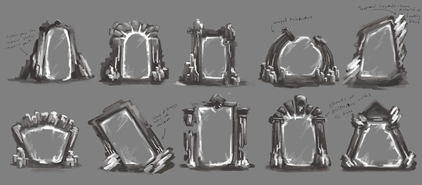
EOS involved a dual-world gameplay wherein portals were used to traverse between the worlds, so I first designed several iterations of the Magic Gates to decide the overall silhouette of the structures.
Crystal growths were used to illustrate the magical nature of the Gates, and their shapes were either naturalistic or warped to convey a more "organic" nature to the design of the Gates.

Once it was decided that the Classical Greco-Roman style would be a part of EOS's aesthetics, I integrated Greco-Roman structures and designs into the design of the Gates.

After the designs of the other puzzle elements were decided, I further refined the Gate to match the aesthetics of the other puzzle elements, including the addition of more Greco-Roman elements.
Sun and Moon Medallion

Left: The day/night cycle is central to the story and mechanics of EOS, and so sun and moon designs were integrated heavily into the puzzle elements that were present. As for how the designs appeared, I experimented with integrating both the sun and moon together (In a sense, working together), as well as having them be separate, although that was limited to working on the sun motif since if that was chosen, the moon motif could be designed using elements from the sun motif.
Below Left: The Medallion plays a key part in the story of EOS, and is the main way the player interacts with puzzle elements. Its design, therefore, was essential to showcase the aesthetics of the environment and the duality of the sun and moon motifs. Initial designs ranged from a one-piece design that links both motifs, to a medallion that could separate into a sun and moon medallion, as part of the storyline.
Below: Refinement of the Medallion, with notes on how the medallion could be used for different proposed mechanics.


Medallion Pedestals

These pedestals are used in-game to activate the Gates that play a part in EOS's gameplay. Various designs were considered from those that were more sci-fi, to those that appeared as though it were growing out of the rock. The later designs contained Greco-Roman elements to tie it better to the lore of EOS.

Refining the chosen design of the Pedestal, the design was simplified from the Greco-Roman pillar design. Notes regarding the mechanics of the Pedestal's usage were applied here, as well.
Other Assets

At the end of each level was a platform that served as an elevator, as the setting of EOS was a tower. We devised different ways these elevators would work, from a mechanical system with a pillar pushing the platform up, to a magical system involving shafts of light as "ropes" that hoist the platform up.

These boxes were made for use in button puzzles, where they would weigh down buttons that would activate various devices in the world of EOS.
They were to be made of stone, and so I designed several boxes that could be used as these weights. I integrated the constellation-like lines with "star" nodes into several designs, as well as the Sun and Moon designs from the Medallion into the boxes. It was important for the boxes to have a comparable level of design detail with the other assets, even if they were only minor parts of the world of EOS.

Ana and Kythois are two characters related to the protagonist of EOS, and since there were to be statues made of them, we had to design what they looked like. Their clothes were based on Ancient Greek clothing, with gold representing the Sun and silver/steel representing the Moon.
UI Concept Art


Top: The UI assets in EOS used a serif font, to reflect the Greco-Roman theme of the game. An underlay of marble was used to reinforce the theme, and I experimented with different approaches to the keyboard/controller button designs, from flat shapes to angled quasi-3D shapes.
Left: Samples of buttons and in-game control reminders. Two different versions were made for each control reminder, as EOS supports both keyboard and Xbox controller input.

The logo for EOS went through various iterations; I integrated the Sun/Moon motif into the design of the logo, and I attempted to experiment with the duality motif present within the game.
Right: Testing different variations of the selected logo design.

Menu Mockups

Left: A mockup of the main menu, the backdrop was a 3D rendition of the exterior of the Tower that serves as the setting of EOS.
At first, the menu buttons were black on gold, but it was switched to white on gold after we placed the menu elements onto the in-game backdrop.


Mockups of the Level Select screen; this was implemented since we wanted a build that allowed people to try all the levels in EOS. They were designed to look like a relief carving looking over a celestial skyscape that would move when the different options were cycled. From left: The Beach, The Garden, and The Summit.

